基于电视剧《繁花》做网站练习,开发制作历程功能,展现从筹备到播映历年时间轴。利用seiper幻灯片切换功能以及css一些使用技巧,可以实现时间导航轴功能,如下图所示:

◆ 利用css伪元素实现时间轴线
如下图,其思路如下:在【swiperHistory区域】设定相对定位,然后利用【::after】伪元素插入一个虚拟元素,即创建一条宽度与该元素相同、高度为 1 像素的黑色水平线条,该线条距离 #swiperHistory 元素的上边缘 10 像素,实现时间轴线效果。
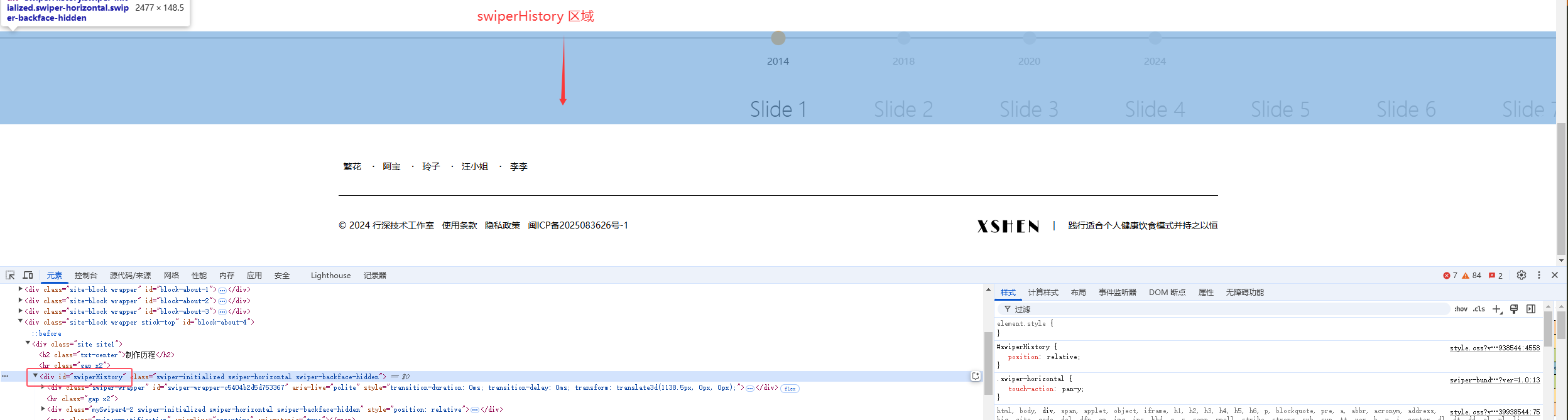
#swiperHistory{
    position: relative;
}
#swiperHistory:after{
    content:"";
    z-index: 0;
    position: absolute;
    left: 0;
    top:10px;
    width: 100%;
    height: 1px;
    background: #000;
}
◆ 利用swiper滑动幻灯片实现时间导航
思路:幻灯片之间间隔为0,幻灯片内容定义两个元素,分别模拟时间导航按钮和时间。
<div id="swiperHistory">
    <div class="swiper-wrapper">
        <div class="swiper-slide history-item">
            <i class="history-dot"></i>
            <p>2014</p>
        </div>
        <div class="swiper-slide history-item">
            <i class="history-dot"></i>
            <p>2018</p>
        </div>
        <div class="swiper-slide history-item">
            <i class="history-dot"></i>
            <p>2020</p>
        </div>
        <div class="swiper-slide history-item">
            <i class="history-dot"></i>
            <p>2024</p>
        </div>
    </div>
document.addEventListener('DOMContentLoaded', function () {
var homeSwiperScope = new Swiper ('#swiperHistory', {
loop: false,
speed: 500,
centeredSlides: true,
paginationClickable: true,
preventClicks: false,
preventClicksPropagation: false,
slidesPerView: "auto",
spaceBetween: 0,
slideToClickedSlide: true,
});
});.history-dot{
display: block;
width: 21px;
height: 21px;
background: #E5E5E5;
border-radius: 50%;
margin: 0 auto 5px auto;
transition: 0.2s all;
}
.swiper-slide-active .history-dot{
background: #ffa836;
transform: scale(1.1);
}
.history-item{
cursor: pointer;
width: 160px;
text-align: center;
color: #aaa;
}
.swiper-slide-active.history-item{
color: #000;
}最终实现效果链接:https://example3.chenzhuzhen.cn/about-fanhua/#