♦ CSS 重置
html, body, div, span, applet, object, iframe,
h1, h2, h3, h4, h5, h6, p, blockquote, pre, a,
abbr, acronym, address, big, cite, code, del,
dfn, em, img, ins, kbd, q, s, samp, small,
strike, strong, sub, sup, tt, var, b, u, i,
center, dl, dt, dd, ol, ul, li, fieldset, form,
label, legend, table, caption, tbody, tfoot, thead,
tr, th, td, article, aside, canvas, details, embed,
figure, figcaption, footer, header, hgroup, menu,
nav, output, ruby, section, summary, time, mark,
audio, video {
    margin: 0;
    padding: 0;
    border: 0;
    font-size: 100%;
    vertical-align: baseline;
    /*font-style: normal;*/
}
“CSS 重置(CSS Reset),不同的浏览器对 HTML 元素有各自默认的样式设置。例如,有些浏览器会为 元素添加一定的外边距,标题元素有不同的默认字体大小和外边距,列表元素 和 有默认的内边距等。这些默认样式的差异会导致网页在不同浏览器上显示不一致,给前端开发带来很大的困扰。可以统一浏览器显示效果、字体大小统一、垂直对齐统一以及便于后续样式设计等好处。
◆ 注意点
如:font-size: 100%; 如果父元素没有显式设置 font-size,则会继续向上层父元素查找,直到找到有显式设置 font-size 的祖先元素并继承其字体大小;若所有祖先元素都未显式设置 font-size,最终会继承浏览器的默认字体大小。若祖先元素设置了 font-size:0,则字体就会看不到。
♦ 页面区域
◆ 页眉区域
- 屏幕宽度<1024px,隐藏页眉区域。否则将页面区域设置为块级元素,确保页眉区域不会被换行。
- 页眉菜单栏始终置顶,不受页面滚动影响
- 页眉最大宽度为1640px(含边距),左右边距20px
#masthead{
    display: none;
}

.site {
    box-sizing: border-box;/*宽度含边距*/
    padding: 0 20px;
    width: 100%;
}

@media screen and (min-width:1024px){
    #masthead{
        display: block;
    }

    .site-header{
        position: fixed;/*始终置顶*/
        z-index: 99;
        top:0;
        background-color: transparent;/*设置透明背景*/
    }

    hgroup.site{
        max-width: 1640px;/*页眉最大宽度*/
        display: flex;
        flex-direction: row;
        justify-content: space-between;
        align-items: center;
    }
◆ 避让head头部区域
#home-headimage{
    padding-top:20px;
    position: relative;
    width:100%;
    /*当元素内的内容超出元素的尺寸时,隐藏超出部分的内容。*/
    overflow: hidden;
}
#home-headimage  .site{
    position: relative;
}
@media screen and (min-width: 1024px){
    #home-headimage{
        padding-top:100px;
    }
元素的样式会根据屏幕宽度来确定。当屏幕宽度小于 1024 像素时,应用基础样式规则;当屏幕宽度大于或等于 1024 像素时,padding-top 属性会被媒体查询中的样式规则覆盖,其他属性保持基础样式规则的设置。
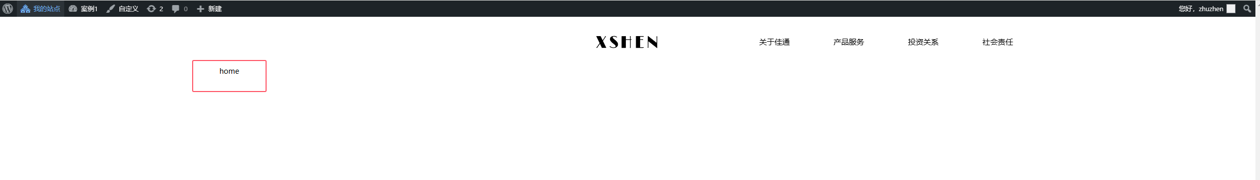
◆ 页眉logo布局
- 首页logo居中
- 其他页眉靠最左


思路:判断当前页面类型,如果是首页,则执行body.home hgroup .site-logo样式。否则默认执行hgroup.site 样式。
@media screen and (min-width: 1024px) {
    /*普通页面logo靠最左*/
    hgroup.site{
        max-width: 1640px;
        display: flex;
        flex-direction: row;
        justify-content: space-between;
        align-items: center;
    }

    /*页面时是首页时,执行该css(logo居中)*/
    body.home hgroup .site-logo{
        position: absolute;
        left: calc(50% - 63px);
    }
body标签中执行body_class()函数,如果当前页面是首页,则自动插入home样式
<body <?php body_class( $custom_classes); ?> >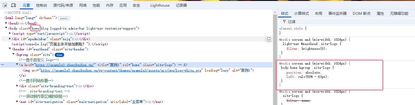
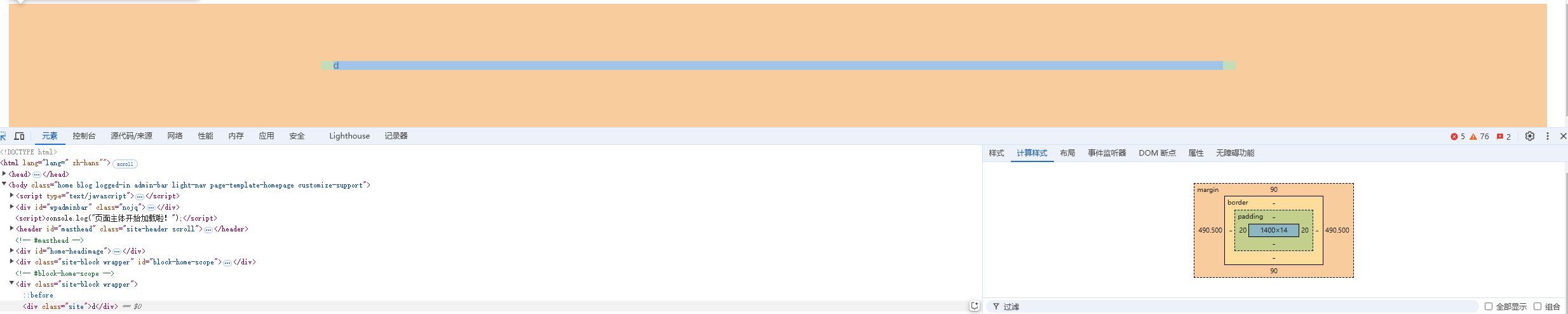
◆ 新建内容块默认布局
左右间距28px,或2个默认字体大小。上下间距90px。宽度屏幕大于768px时,设置1440px,并清除浮动干扰
/*当 box-sizing 的值为 border-box 时,元素的宽度和高度包含了内容区、内边距和边框,但不包含外边距(margin)。*/
.site {
    box-sizing: border-box;
    padding: 0 20px;
    width: 100%;
}

/* Minimum width of 768 pixels. */
@media screen and (min-width: 768px) {
    .site {
        margin: 0 auto;
        /*		max-width: 1600px;*/
        max-width: 1440px;
    }

.site-block .site{
    overflow: hidden;
    margin:60px auto;
}

@media screen and (min-width: 1024px){
    .site-block{
        padding: 0 28px;
        padding: 0 2rem;
    }
    .site-block .site{
        margin:70px auto;
    }

@media screen and (min-width: 1600px){
    .site-block .site{
        margin:90px auto;
    }

/* 清除浮动干扰 */
.clear:after,
.wrapper:after,
.format-status .entry-header:after {
    clear: both;
}
.clear:before,
.clear:after,
.wrapper:before,
.wrapper:after,
.format-status .entry-header:before,
.format-status .entry-header:after {
    display: table;
    content: "";
}
<div class="site-block wrapper">
<div class="site">d</div>
</div>最终效果如下:
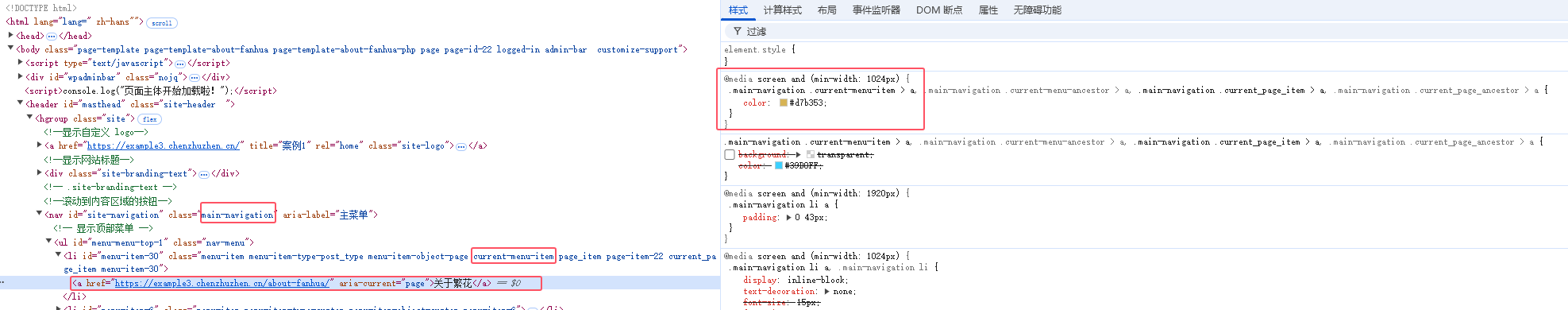
◆ 菜单随鼠标悬停时变色
    .main-navigation .current-menu-item a:hover,
    .main-navigation .current-menu-ancestor a:hover,
    .main-navigation .current_page_item a:hover,
    .main-navigation .current_page_ancestor a:hover,
    .main-navigation a:hover,
    .main-navigation a:focus{
        color: #d7b353;
        /*background-color: #fff;*/
    }
    .main-navigation .current-menu-item > a,
    .main-navigation .current-menu-ancestor > a,
    .main-navigation .current_page_item > a,
    .main-navigation .current_page_ancestor > a  {
        color: #d7b353;
        /*background-color: #fff;
		/*font-weight: bolder;*/
        /*background-image: url(images/bg_nav_current.png);
		background-repeat: repeat-x;*/
    }

◆ 控制合适的图片尺寸和比例
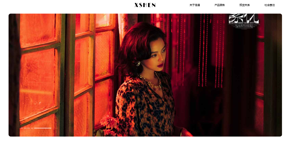
宽度自适应父容器,设置一定高度,并按比例缩放,使其其宽度或高度至少有一个完全填满容器,多余部分裁剪。
.top-image {
    object-fit: cover;
    display: block;
    width:100%;
    height: auto;
    max-height: 720px;
    min-height: 420px;
}
object-fit: cover:cover 值表示元素会按比例缩放,以填充整个容器,同时保持其宽高比。假设一个图片元素应用了 .top-image 类,其容器宽度为 800px,高度为 600px,而图片的原始尺寸为 1000px×800px。由于图片的宽高比与容器不同,使用 object-fit: cover; 后,图片会按比例缩放,使其宽度或高度至少有一个完全填满容器,多余的部分会被裁剪掉。
display: block:属性用于设置元素的显示类型。block 值表示该元素会以块级元素的形式显示。块级元素会独占一行,并且可以设置宽度和高度。将图片元素设置为 display: block; 可以避免图片下方出现不必要的空白间隙,因为图片默认是内联元素,内联元素之间会有一些默认的间距。
height: auto:height 属性用于设置元素的高度。auto 值表示元素的高度会根据其宽度和原始宽高比自动计算。结合 width: 100%; 使用,可以保证图片在宽度自适应的同时,高度也能按比例缩放,避免图片变形。
♦ 标题2
◆ 标题3
段落
段落
段落